Useful Tips for Posing


A few weeks ago, I received an inquiry from a spectacular artist named Katherine who needed new headshots for an exhibition profile. Other than the requirement that the photoshoot needed to happen ASAP, everything seemed pretty normal. That is until the consultation meeting, when Katherine told me “well, maybe I should have mentioned this before, but I’m 7 months pregnant and even though I love my stage and how I’m looking, this portrait is to promote an ongoing art exhibition and I don’t want to make my pregnancy the focus of the images”.
The first words that crossed my mind were: 1. Holy 2. Guacamole. But then I reminded myself that as a photographer, my job is to create the best images for my clients and to do anything possible to overcome any problem that may arise (not that her pregnancy was a problem- I had just never been asked to hide a baby bump before!) So we talked about how a good combination of clothing choices, posing, and props can help to take the focus off some features and enhance others.
Fast forward to the next day. I arrived in a beautiful studio with tons of natural light. A photographer’s dream! But I was still nervous about hiding that baby bump. Would we be able to pull it off? I swallowed my nerves and decided to dive right in. I’m the expert right? I spent the previous day reading up on tips and was ready to put them to use for the first time. So here’s what I did:
The most important principle to remember is that whatever is closest to the camera will appear larger in a photo, and whatever is farther away will appear smaller. This is why you will often see models leaning forward at awkward sharp angles in high fashion photography- the photographer is accentuating certain features.
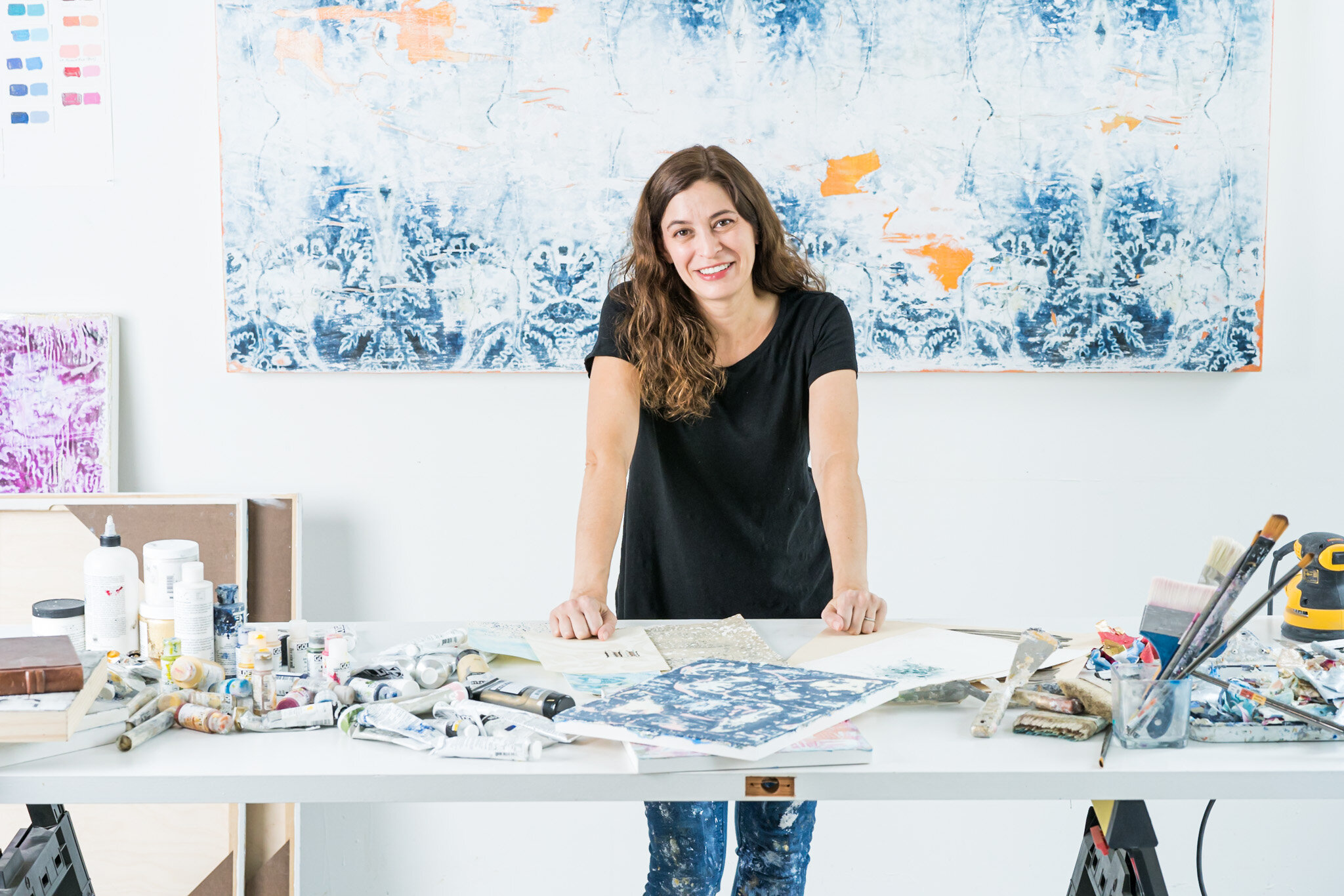
Following that principle, I posed the client in the middle of the image, leaning forward with her bump as far as possible from the lens.
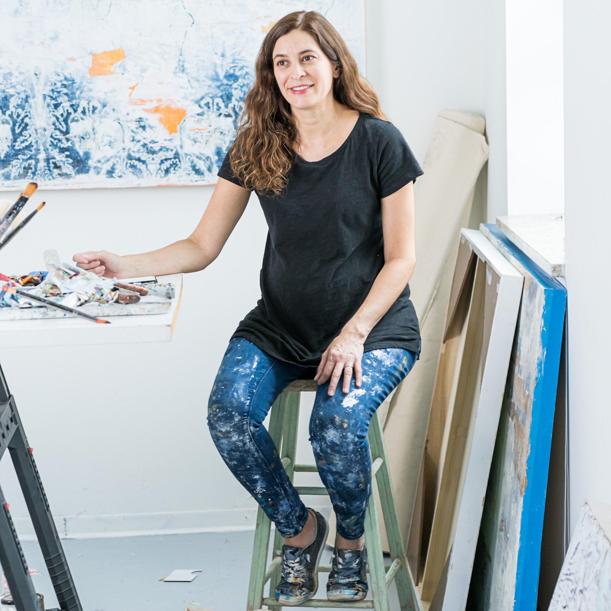
I also encouraged my client to wear dark clothing. Black does a great job of hiding visual interruptions so the eye can easily travel from head to toe with minimal visual distractions.
We placed the table with her art supplies in the foreground. This serves two purposes: first, it tells a story of what my client does and also distracts the viewer from her bump by placing multiple colorful items in front of her.
Finally, I used the walls and canvas as a background to keep telling the story of my client and create a sense of continuity between the table, the artist and the art. The contrast between the white walls and the black shirt directs your eye straight to her smiling face.
Following these simple but critical best practices, I was able to showcase Katherine’s face and art as the focus of the image. By placing her, the subject, in between her wall art and the table full of art supplies, we told a story about who she is as an artist without calling attention to her baby bump. Congratulations, Katherine!
If you are in need of professional headshots or staged photos to promote your work, don’t hesitate to reach out by visiting the “Contact Us” page of our website: https://www.andinophoto.com/contact-us.
